new york times games
↗️ Prototype
tldr;
Coming in at #4 on the US Gaming/Word App store category, the New York Times Games App is incredibly popular. However, it lacks developed social features and game statistics.
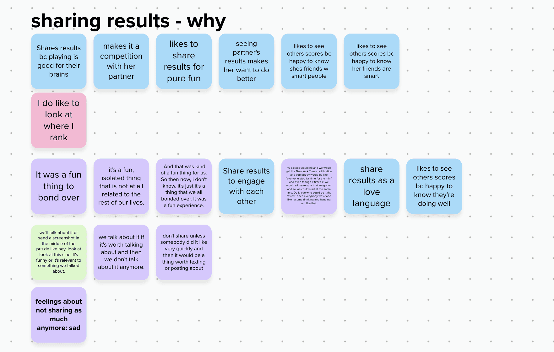
Research showed that NYT Games users like to see their stats for different games, but don’t keep track of them because there isn’t a way to. It also showed that users like to share their results with others, mostly as a way to bond with their friends and loved ones.
Furthermore, they are more likely to remember to play games when they see that their friends have played them.
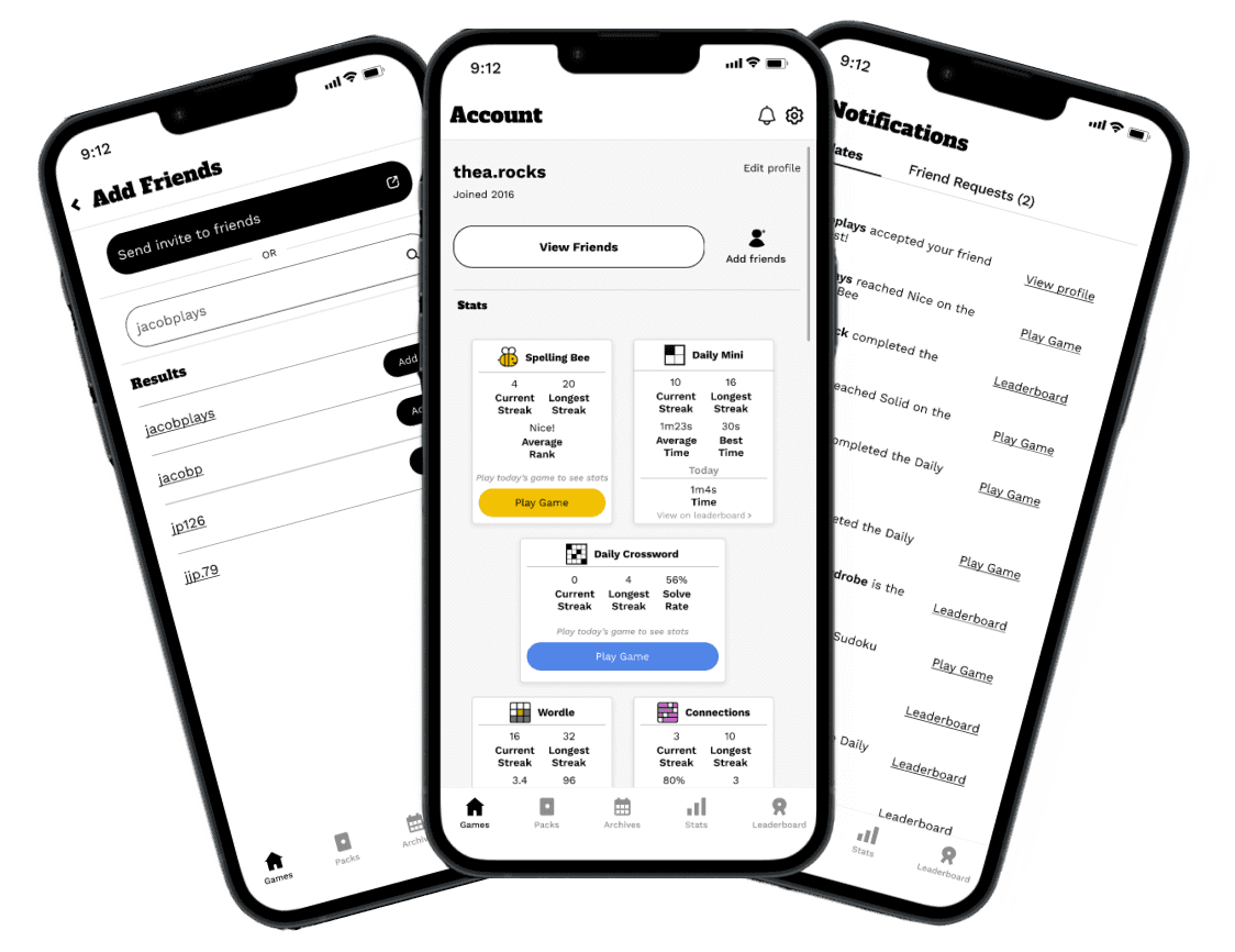
Key design priorities were creating both the user and friend profiles that showed statistics for the different NYT games as well as the process for adding and accepting friend requests.
Timeline:3 weeks —completed October 2023
Project type: Mobile App Feature Addition
Tools: Figma, Figjam, Mural
Role: End-to-end UX designer
context
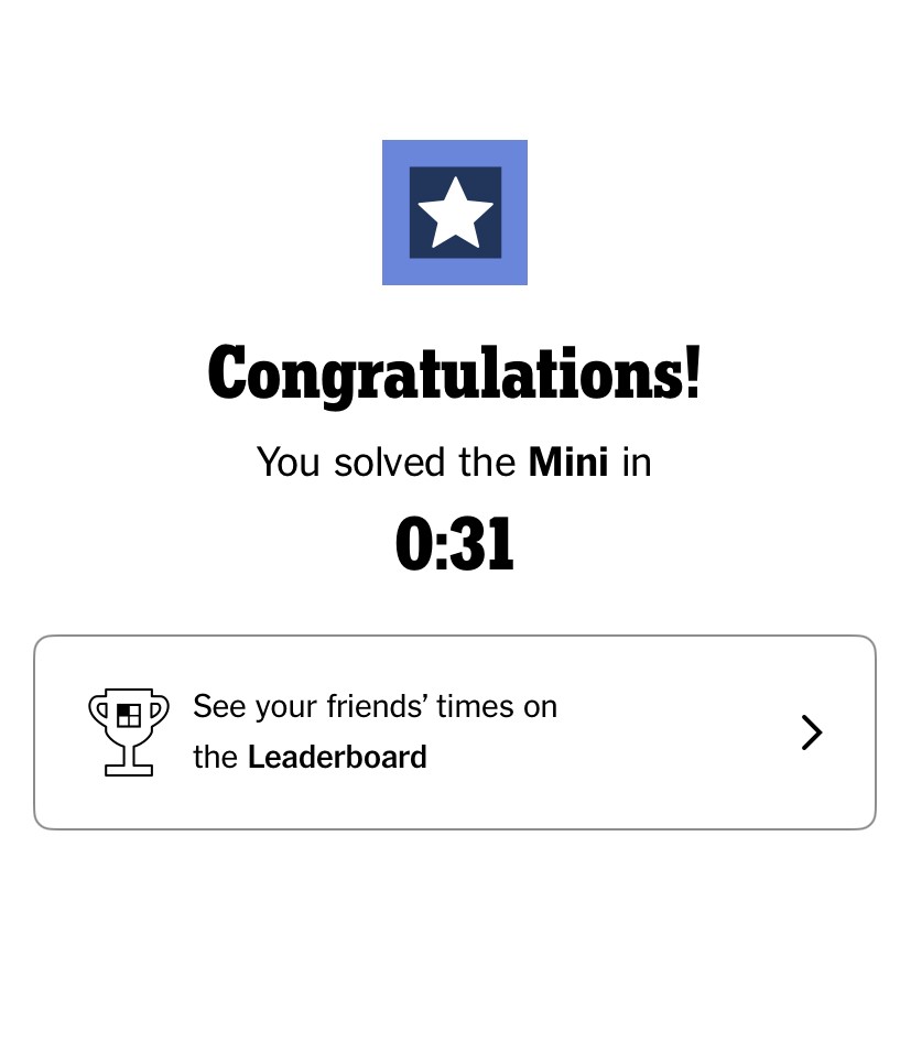
The New York Times Games app has a multitude of games: Sudoku, Spelling Bee, The Daily Crossword, Letter Boxed, and perhaps the most recently famous, Wordle. For several months, you couldn’t escape the craze; all over social media, people were posting their attempts, the green emoji boxes filling up Twitter feeds. This sharing function isn’t unique to Wordle; all of the NYT games prompt you to share your stats upon completion. But what about sharing stats within the game itself? There’s a leaderboard for the Daily Mini, but as of the time of writing, it’s the only game you can share scores with.
What if each user had their own profile, complete with information about all of the games? What if users could add their friends, thus allowing them to compare stats, see updates, and more?
problem:
The NYT Games app has over one million subscribers, but the social aspect is underdeveloped.
Furthermore, statistics for different games on the app are either hidden or don't exist.
Solution:
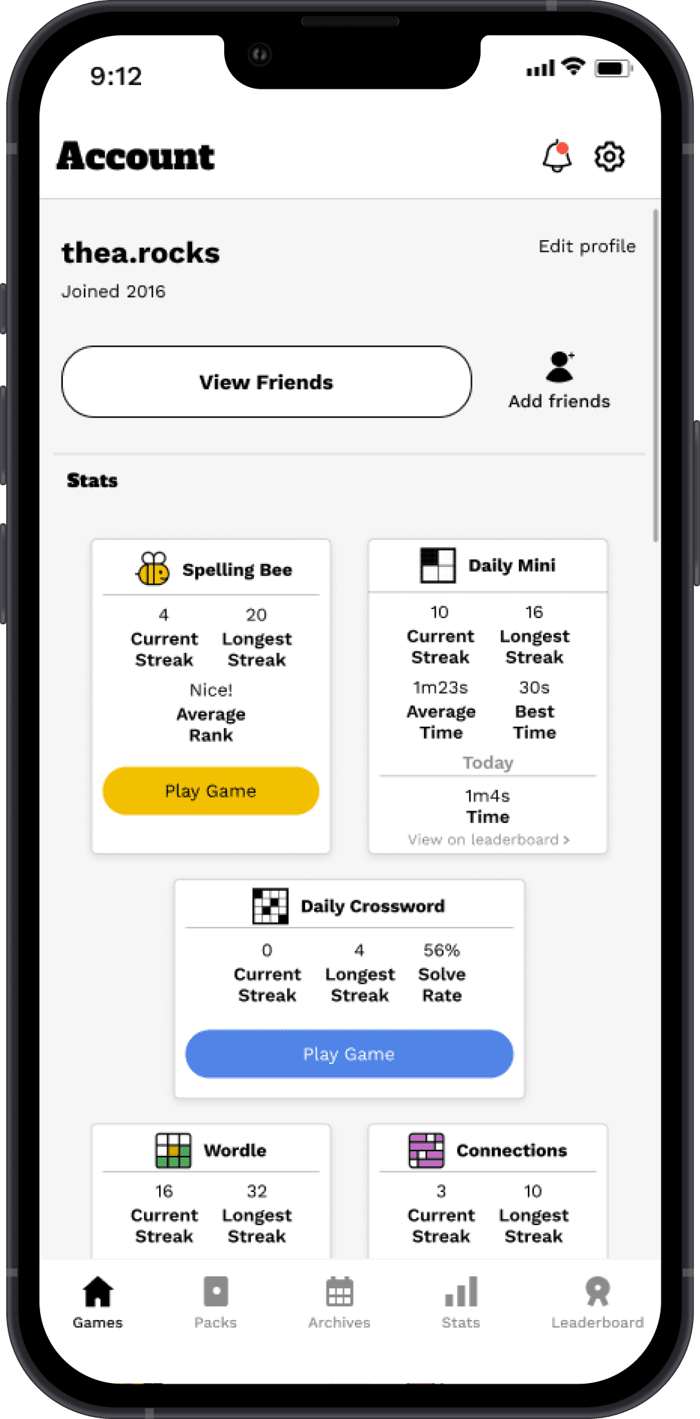
Each user has their own profile which shows stats for each game, and they are able to friend others and compare their stats.
research
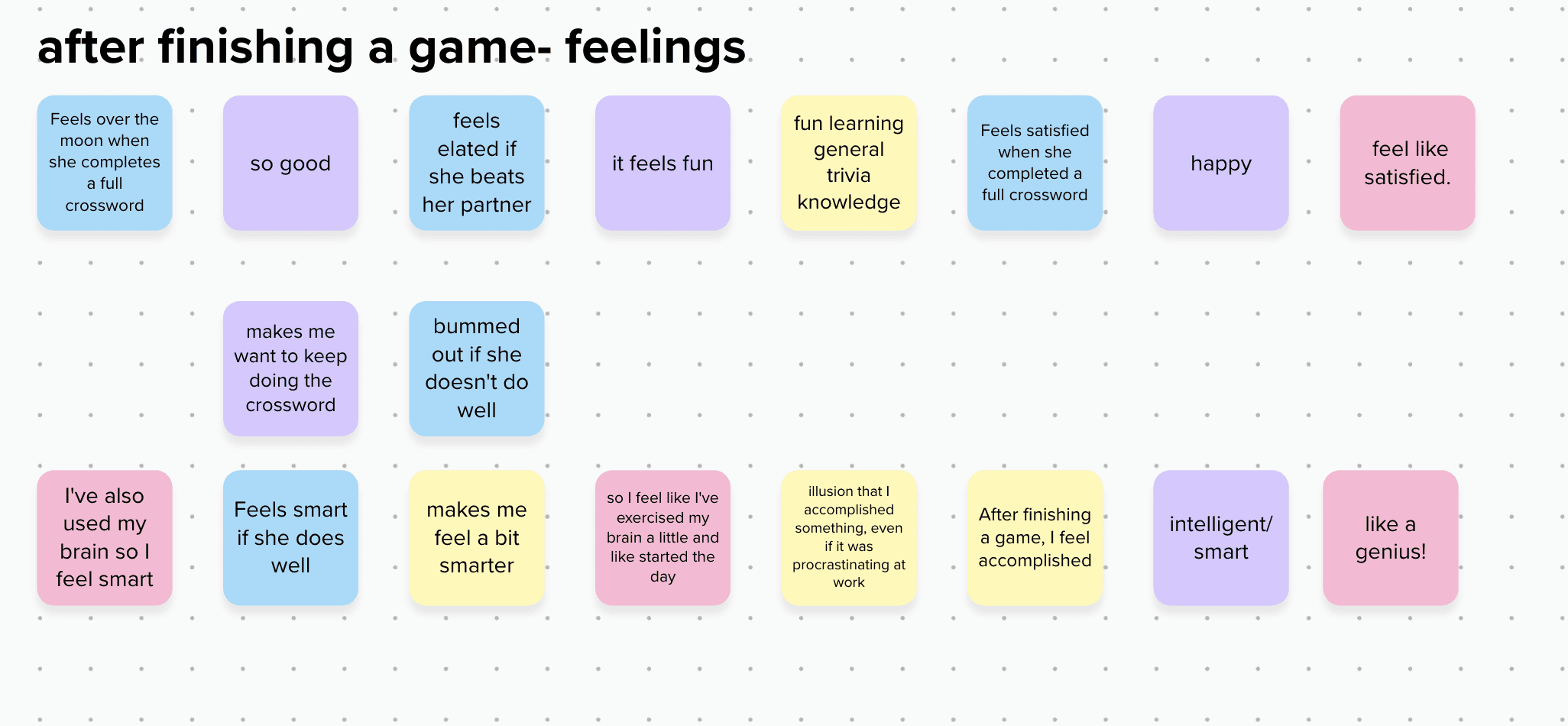
What do people do after completing a game?
Competitive Analysis
While I completed interviews, I conducted a competitive analysis of three different gaming apps.
This is what I found: The Washington Post is most likely the NYT's biggest competitor when it comes to games because they offer free access to all games and statistics.

Words With Friends 2
“Challenge your brain and connect with friends and family through Words With Friends!”
Pros
Stats show total points & average word score against your opponent
Profile with stats on it
Daily streaks
Can add friends
Cons
Inundated with ads, makes for a very annoying experience
Many pop-ups, can make it hard to accomplish a task due to dealing with these
User is tricked to create games

USA Today
“The pulse of the nation in the palm of your hand.”
Pros
Has full & mini crosswords
Has unique games NYT doesn't have
Stats for both crosswords (streaks, puzzles solved, solve rate, fastest time, & average time)
Cons
Other games besides crosswords & sudoku are hidden
Cannot add friends, no leaderboard
Interviews
key insights
RE: Use of the NYT Games App
use NYT Games the most out of any gaming app
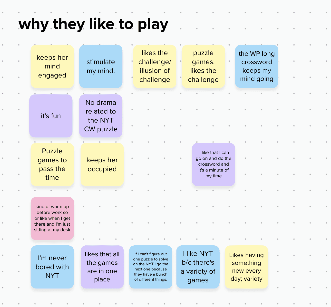
like to play for the challenge
like to play for the variety of games all in one place
RE: Sharing results
have shared their results in the past
share for competitive reasons
share to bond with others
will go play NYT Games when they see others' results
"sharing results is a love language"
“I want to join in on the fun!”
“Seeing other’s results encourages me to go play”
affinity mapping
user personas
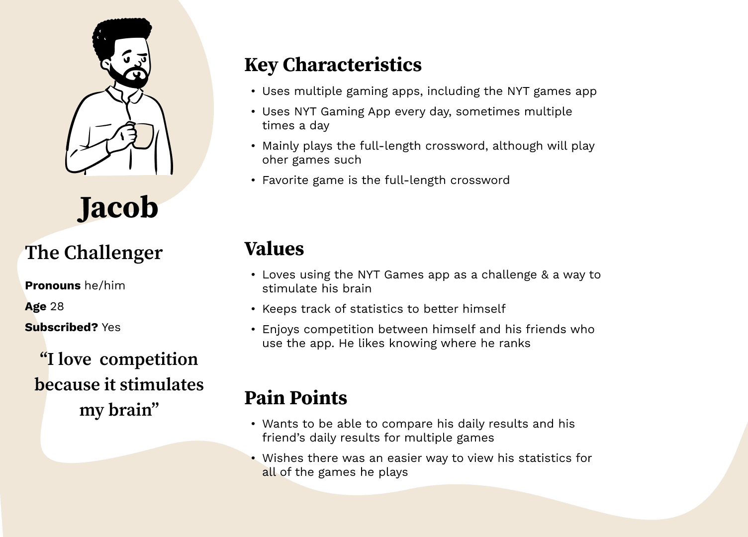
I found that two separate personalities were arising from my research. The first one plays every day and relishes competition. That’s Jacob. I call him “the challenger.”
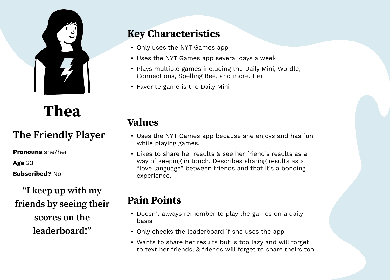
The next user persona I’ve dubbed “the friendly player.” Even though she only uses the app a few times a week, she loves to see her friend’s scores and has fun using the free games when she remembers to play. Meet Thea.
define
Then, it was time to start figuring out what the new feature was going to look like.
Point of view & how might we
Because I have two personas with different goals, that led to two separate problem statements, point of view statements, and how might we statements.
Problem
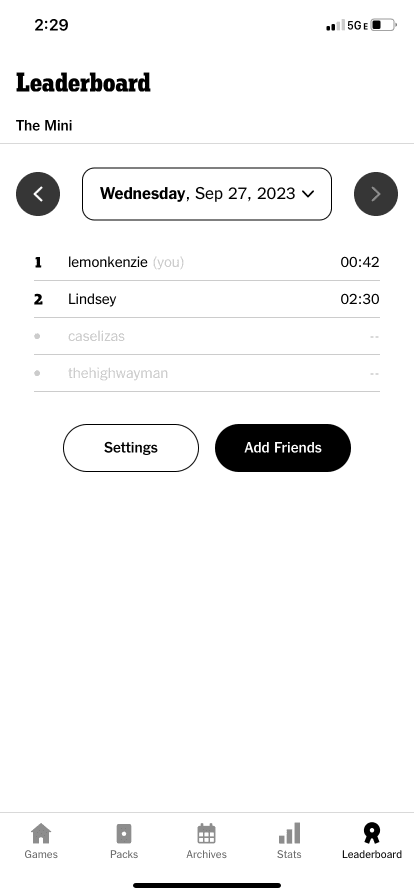
The NYT Games app lacks a full social feature. Most users must text their friends their scores, and oftentimes will skip sharing because texting takes too long. The leaderboard is used, but it only shows the mini and lacks all other games.
POV
I’d like to explore ways that NYT Games users can have a more social experience while playing the app because they are more likely to play more often after seeing others play.
HMW
How might we encourage NYT Games users to share and view results with others?
How might we make sharing results with other users a rewarding experience?
Problem
The NYT Games app statistics aren’t fulfilling their users' needs as the full-length crossword is the only one users can view at any time. All other gaming stats can only be viewed after completing a specific game.
POV
I’d like to explore ways for NYT Games users to easily view statistics for more games because seeing stats such as streaks is a motivator to keep playing and keep getting better scores.
HMW
How might we show statistics for all NYT games?
User flows
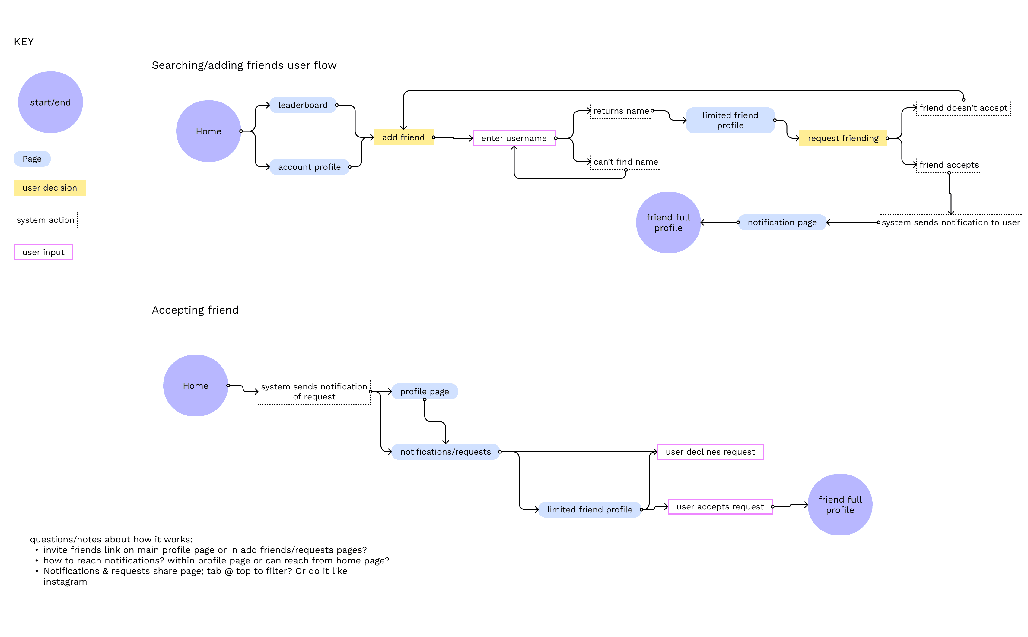
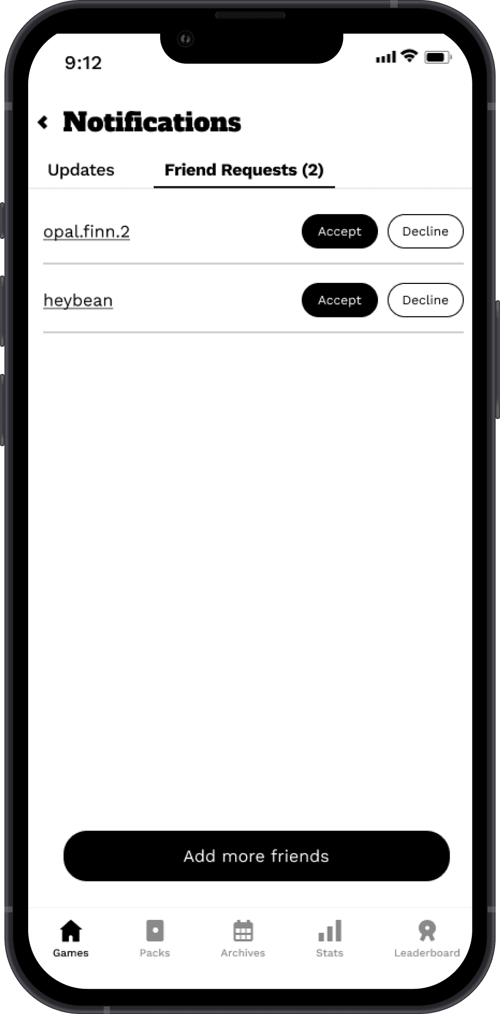
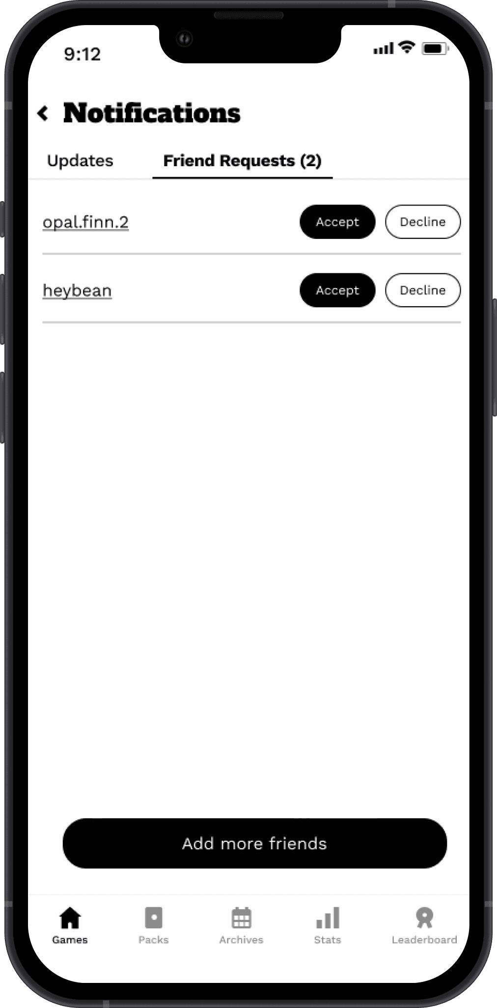
I decided on the most important aspect – the action of adding and accepting friend requests. Because most users remarked that they’d only want to add people they knew, a request system would be best so that random usernames aren’t popping up on the leaderboard or in notifications. The social aspect is more about friending rather than following other users.
Design
low-fidelity
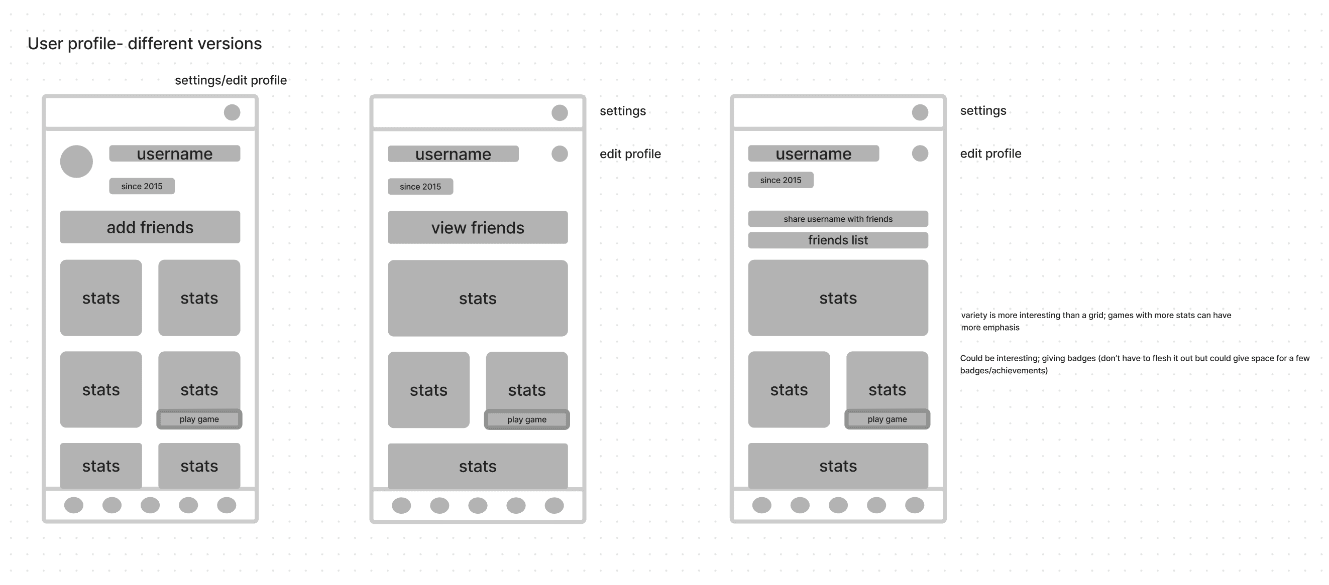
As I began to figure out how things would work, some questions arose.
How do I integrate the profile? Do I keep it where it currently is and keep the statistics tab in the bottom? Or do I replace the statistics tab with a profile tab?
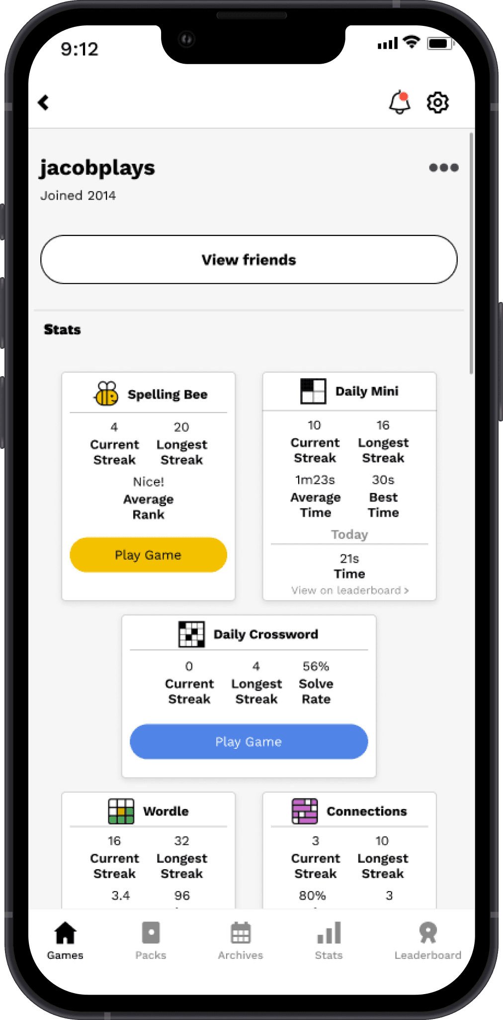
I ended up deciding to keep the profile and stats tab where they currently reside to keep things familiar to the user. The profile will have snapshots of game statistics, and the actual statistics tab can be a deeper dive into each game.
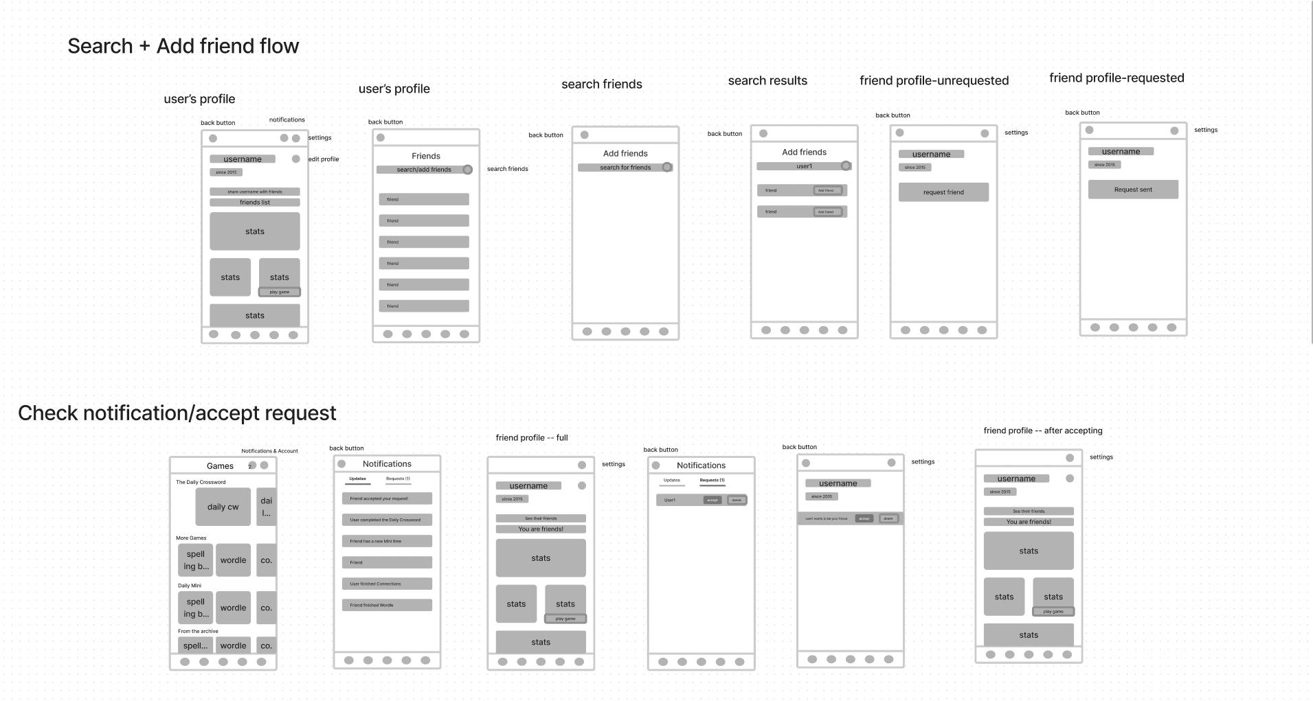
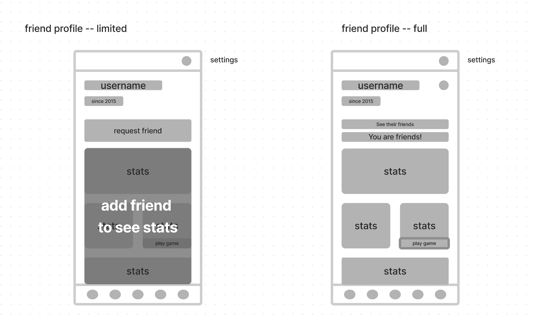
high-fidelity
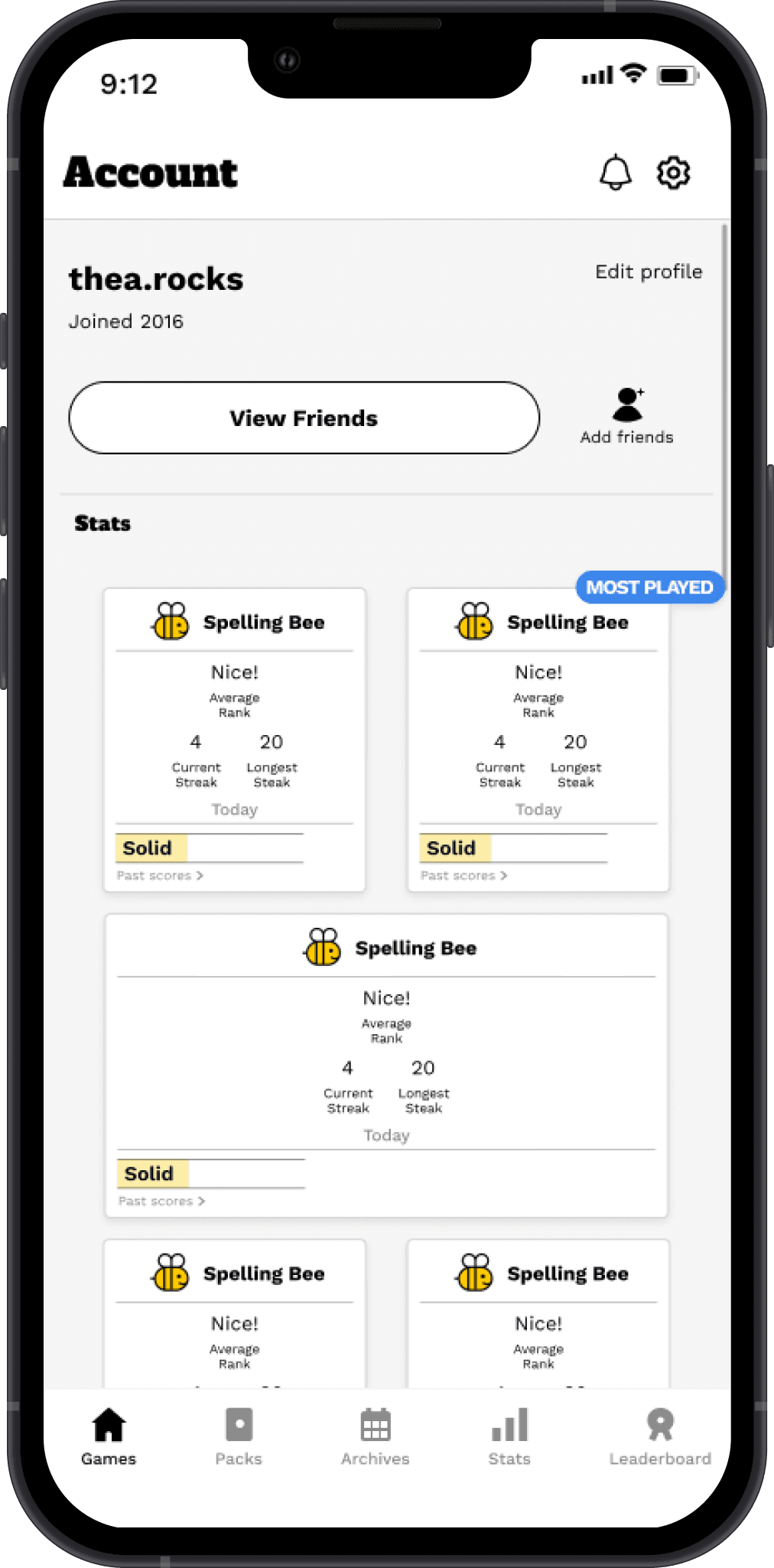
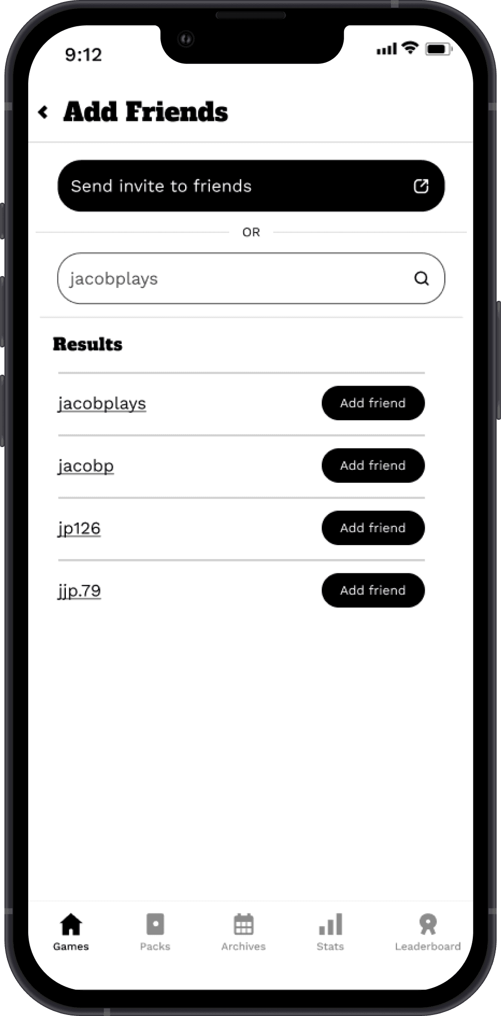
Moving into the high-fidelity phase, I changed and added a few aspects.
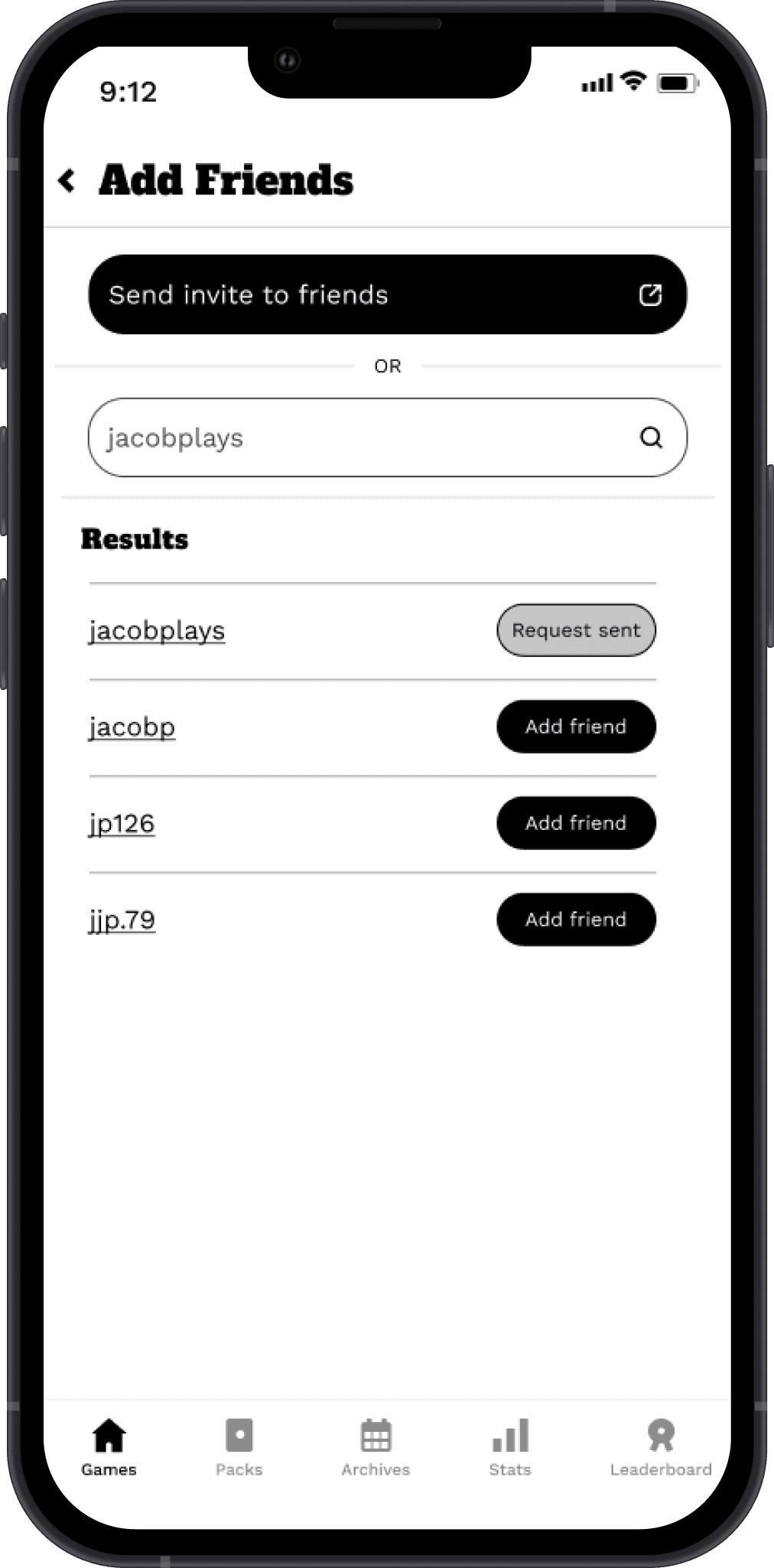
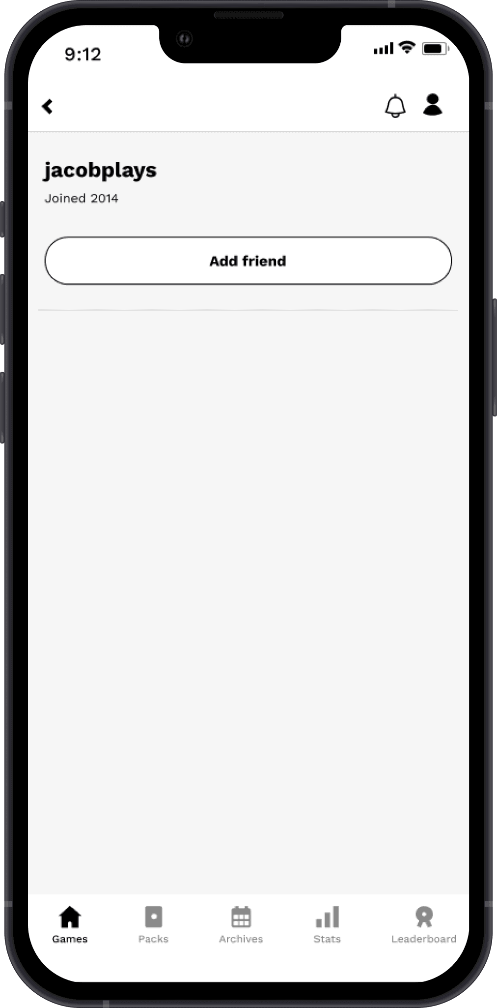
Add friend button I moved to the profile page as it's easier to find this way
Share profile CTA I moved inside the "add friend" page because it's a form of adding friends
Added three dots to the friend profile to indicate management (block, report, unfriend)
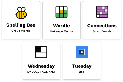
For this version of the high fidelity frames, I didn't change each card to represent each individual game because I wanted to move forward with testing the new feature. That's why the pages are full of bees!
Testing
5 NYT Games users interviewed
Moderated tests over video calls
Tools Figma Prototype, GoogleMeet, Calendly, Otter.ai, Mural.co
Goals:
Evaluate usability and intuitiveness
Validate design decisions
Tasks:
Search & add a new friend
Check your notifications
Accept a friend request
key insights
liked the addition of the profile & stat cards
thought it was straightforward & nothing was confusing or difficult
thought it would increase engagement
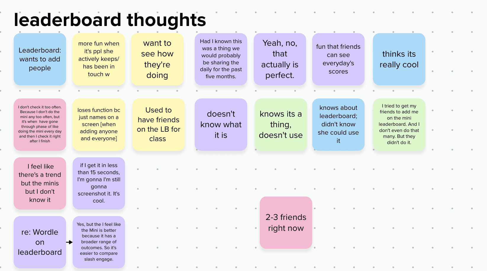
mentioned wanting to see the leaderboard screens
wondered why the NYT Games app doesn't already have something like this.
subsequent iterations
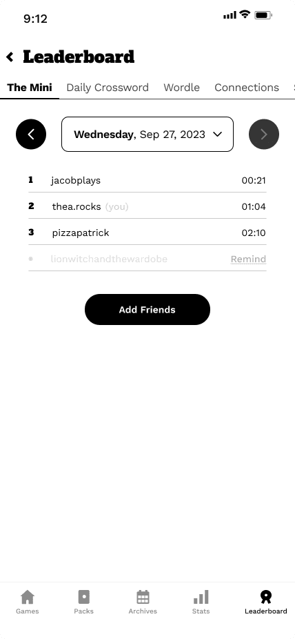
Adding a leaderboard screen
This was originally outside of the scope of the project, but I was able to design what the leaderboard looks like with the other games added.
Notable design choices:
Letting users send reminders to their friends who haven't completed a game that day — this encourages people to play
Kept a way to add friends straight from the leaderboard — this is a quick and easy way and encourages users to add more friends
Removed the settings button, as the actions of editing the display name, viewing friends, and blocking are now located within the user's profile
Stat Card Redesign
In the first version of my high-fidelity designs, the cards were less detailed and visually more difficult to see. Going into the iterations, I decided to update the look of the cards by bolding the stat labels and making the text larger.
Then, I needed different versions of the cards for when users had completed vs hadn't completed the games yet. The first card is for when the user hasn't completed a game yet that day. The second is when both a user and their friend have completed the game for the day. The final version is when the user has completed a game, but their friend has not, which is why there's a reminder prompt.
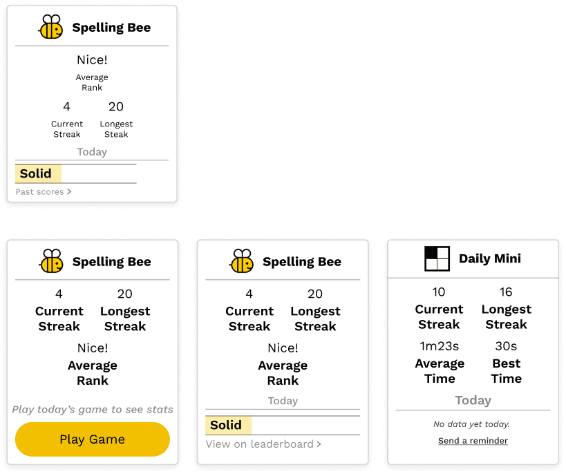
original design (top)
updated design (bottom)
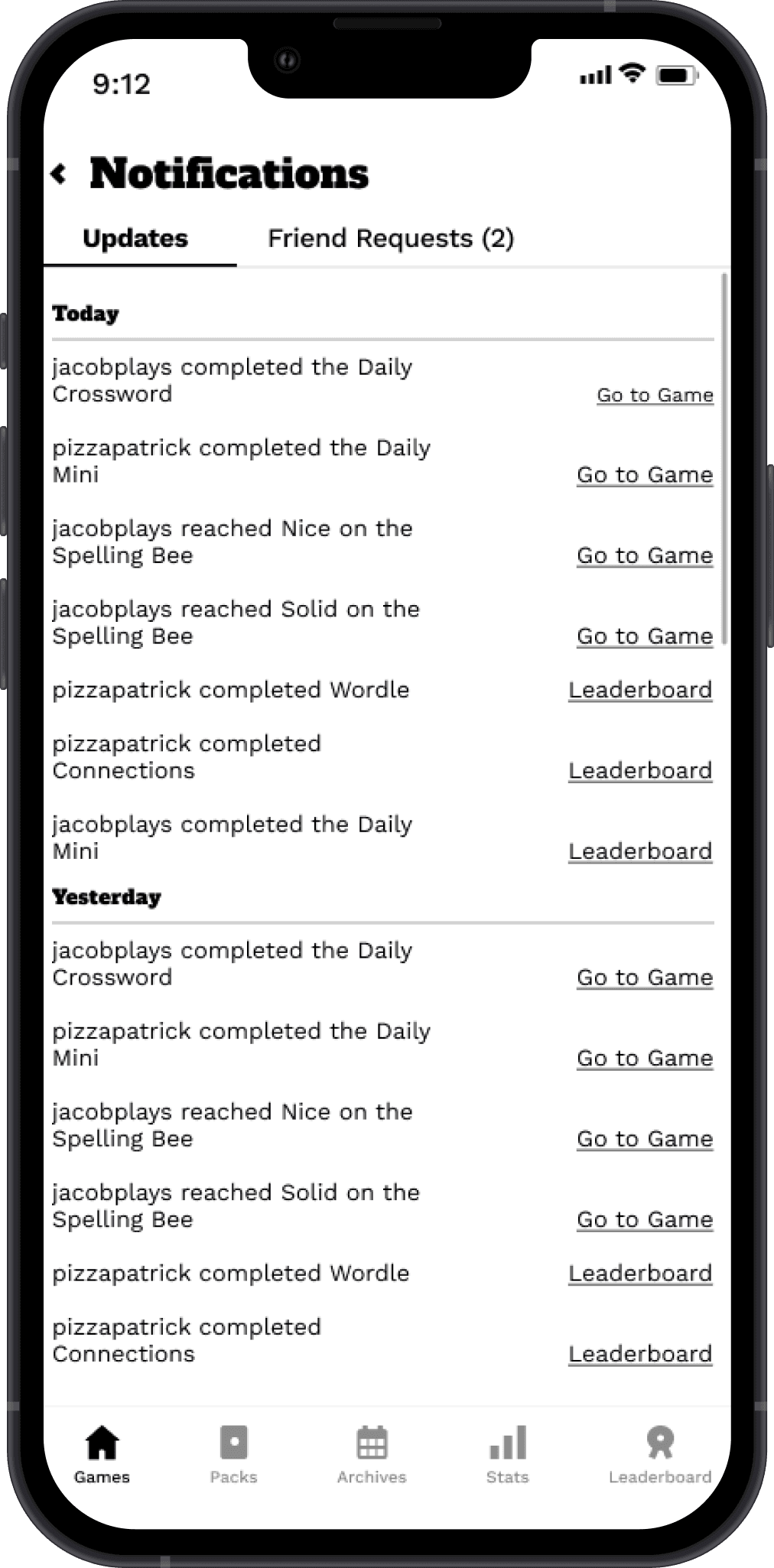
Notifications Redesign
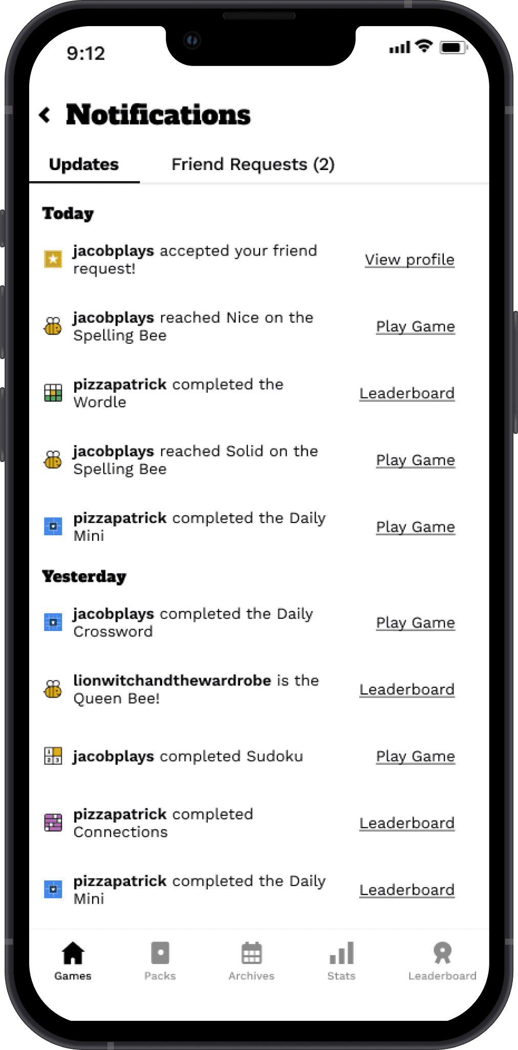
For the notifications page, I noticed it looked very dense, and not visually interesting enough. To combat this, these are the things I changed:
Added game icons next to the notifications to easier signify which game a user completed; this also adds a pop of color and interesting visuals
Bolded each player's username to help it stand out; it also signifies a link to their profile
Changed the size of "Today" and "Yesterday" and spaced out each notification to give it a more spacious feel
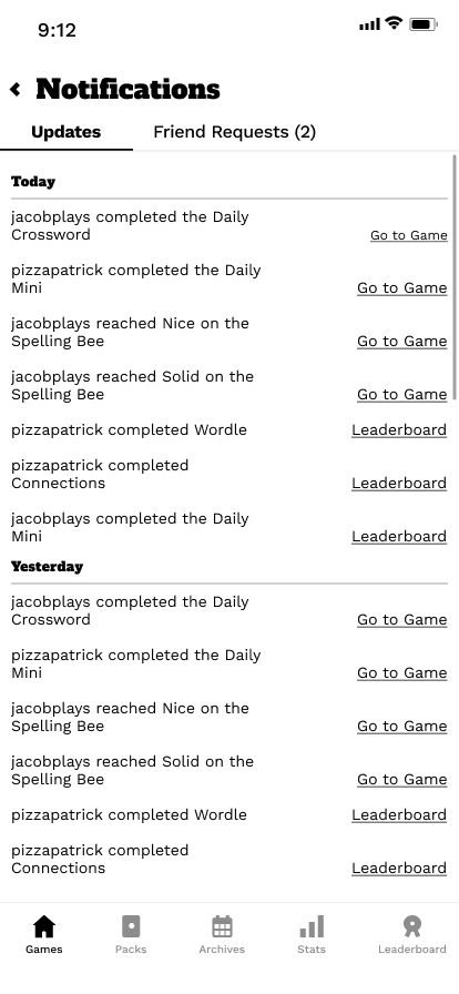
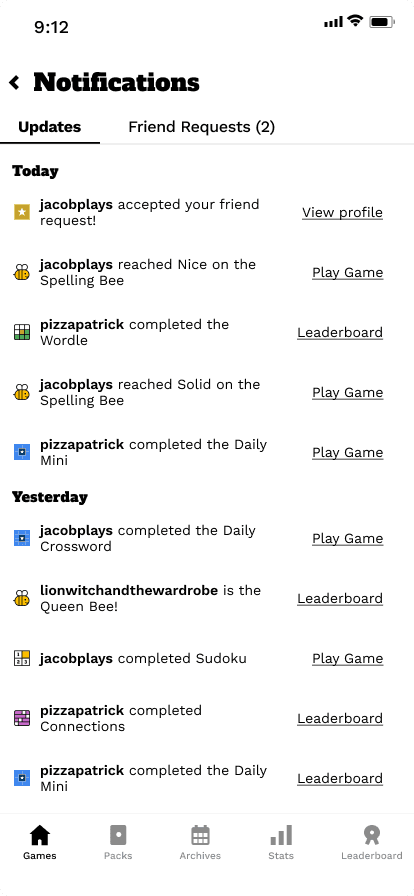
updated design
updated ui component kit
In order to manipulate different parts of the app, I recreated several of the app's UI assets, including game cards and navigation bar icons. I also created different variations of the cards, where the state depends on the games users and their friends have completed.
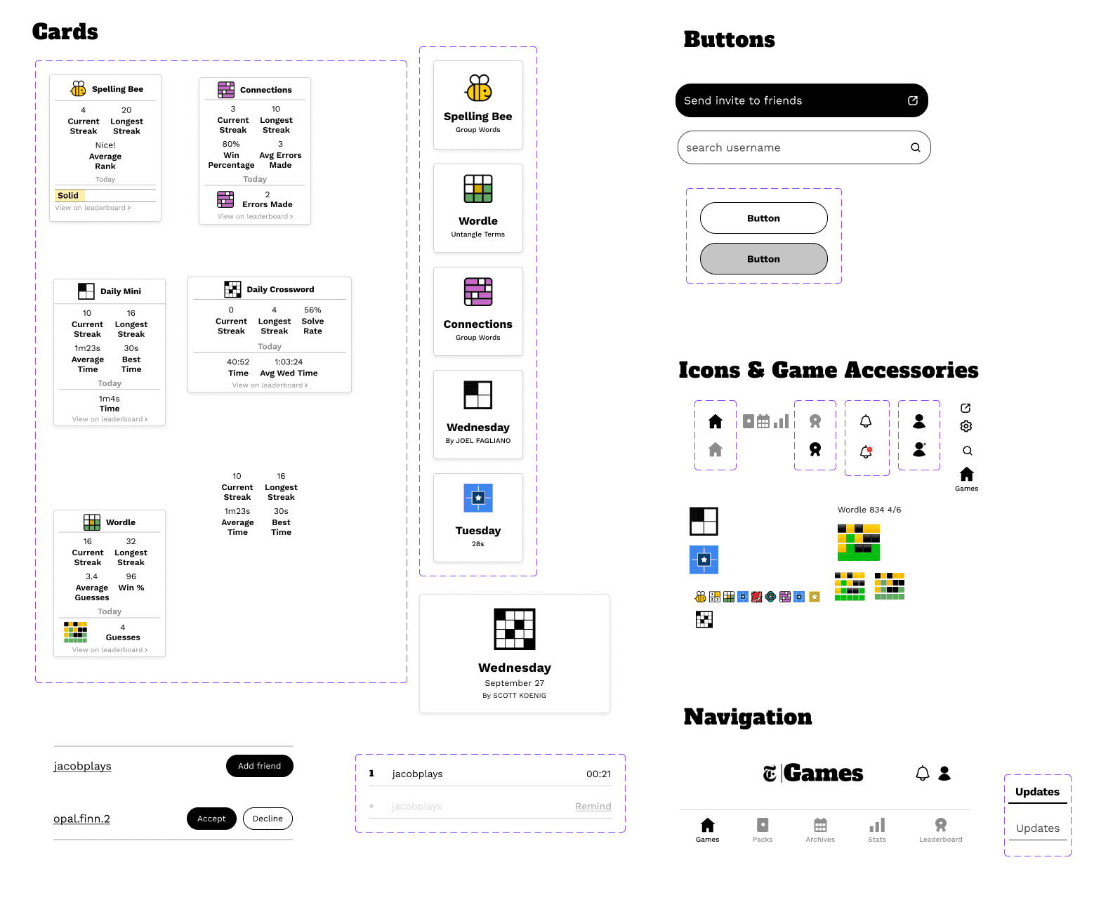
high fidelity screens - v2
conclusion
next steps
More Stats!
I'd like to design the rest of the game stat cards for the profile page, as I only did my interviewees' most popular games.
For the leaderboard, I wanted to design what the stats would look like for all of the games, but since it was outside of the scope of the project, I only had time to design stats for one game.
Profile Customization?
While I was deciding what the profiles would look like, I decided to skip a profile picture and biography. This was because I wanted to match the NYT's brand vibe, and a profile picture could throw this off.
If I had more time, I would love to make a customizable avatar in the NYT Games style using my illustration skills!
MUSINGS
Something I learned during this project was the importance of testing the wireframes up and down before using them with testers. Because of some issues with the prototype I tested, some of my data focused on those limitations rather than what I actually wanted to test. However, I still was able to get data that was useful to the project.
I very much enjoyed this project, as I love the NYT Games App and it's something my friends and I bond over. All of my testers and friends who saw my project mentioned how much they liked it, and that they’d love for the NYT to have this– which is something I’m proud to hear, although I now expect to see my screens whenever I open the real app!
