letterboxd
MY ROLE
Product Designer
TOOLS
Figma
Figjam
Timeline
2 weeks
project type
Mobile App Redesign
description
Letterboxd is a social mobile app where film lovers can log, rate, and review movies, and view their friend's activity.
context
As a consistent user of Letterboxd, this passion project was born from frustrations both I and friends have had while using the app.
For the constraints of my project, I narrowed in on what seemed to be overall the most frustrating feature due to its lack of hierarchy and overwhelming architecture: the user's profile.
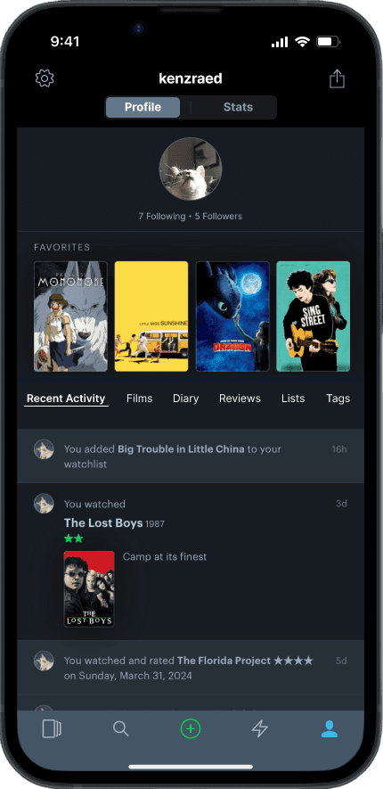
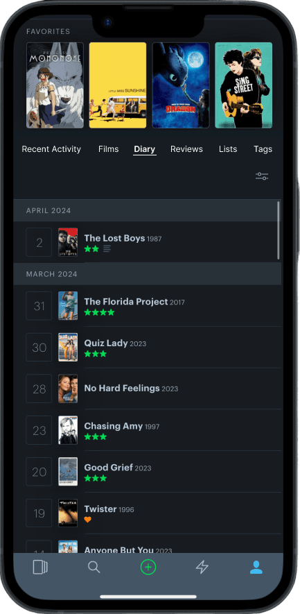
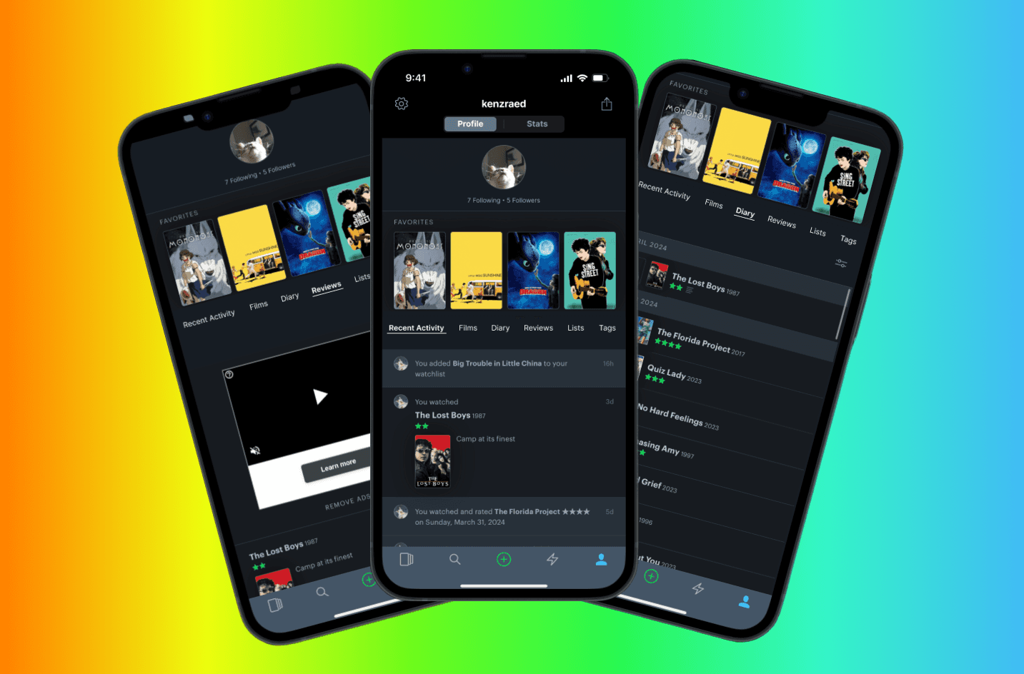
With the information architecture being the biggest issue, I took inspiration from social media profiles for organization. Since Letterboxd's profile has multiple features, I split them into two types: static overview which is always visible, or tabs that users can swipe through.
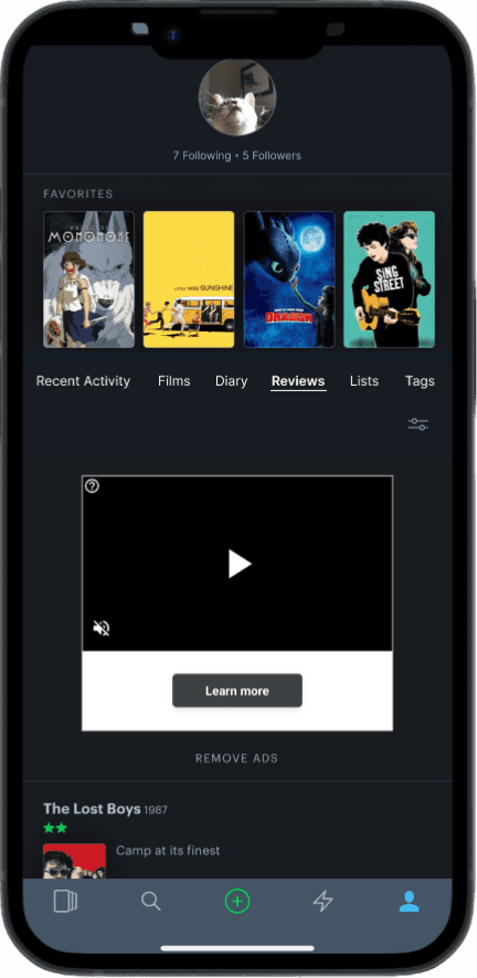
The redesign resulted in a much clearer, intuitive profile that decreased user frustration while using the app.
Challenge:
Letterboxd’s profile layout is unnecessarily complex, with repeated and nested elements that confuse and frustrate users.
Solution:
A simplified profile that utilizes a tab structure for easier viewing of different activities.
research
GOAL:
Identify any user pain points surrounding the profile feature and identify ways to make it more intuitive.
Competitive Analysis
First I needed to see what other entertainment-focused apps Letterboxd was up against. I started with IMDb and Justwatch, two database-style entertainment mobile apps.
This is what I found: Letterboxd is the only database-style movie app with a social aspect; therefore, it should hone in on the reasons people use social apps.
Watchlist
Cast & Crew Info
Streaming Guide
Friending
Interviews
What are the main functions people use when on Letterboxd?
How do they navigate through the app? What tabs do they use and why?
How do users interact with content from users they follow?
key insights
Letterboxd's main use is for logging/writing reviews/keeping track of ones activity and thoughts; however users do also really enjoy the social aspect and interact with what their friends log. They are inspired by what their friends watch.
"Others' activity inspires me to watch more movies"
Main frustration is with confusing layout of app. Things are in the right places, but it takes too long to get there. This can be due to the layout and lack of hierarchy with choices.
"feels like there’s one too many steps to get to where you want"
“I cannot navigate their site”
“A lot of clicking on the right things and I’m not sure how to do it”
define
With the pain points identified, it was time to find a solution.
POV
I’d like to explore ways to help frustrated and confused Letterboxd users to have an easier time navigating the profile because people are getting frustrated trying to use the app.
HMW
How might we reduce the confusion and frustration Letterboxd users feel while navigating the profile?
design
Stage one - too many pages!
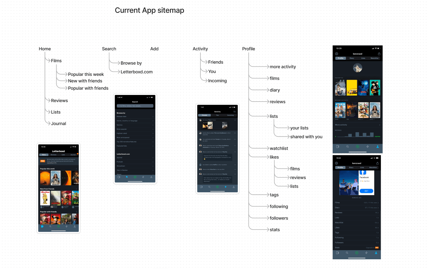
Because most users were struggling with the profile page, that's where I started. They were getting stuck and confused with the list of links, often clicking several to get to where they needed to. Even the sitemap showed just how many pages were linked to that one page.
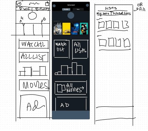
Initially, I tried to make the profile page more visual, with fitting as much as I could onto the one page so users didn't have to click through several pages to get to where they wanted.
However, there were too many functions contained on the profile page, so I started to look at other pages and see how I could move parts of the profile there.
At this point, it didn’t feel like it was working to me. Yes, it was more visual. Less confusing? I didn't think so.
stage tw0 – time to reconsider things
Since I wasn't finding a good solution for the user profile, I decided to conduct an indirect competitive analysis. As Letterboxd's niche among the film app world is their social aspect, it made sense to look at profiles from social media networks. These are the social medias I analyzed:


After seeing how Twitter, Instagram, Pinterest, Reddit, and Facebook had some sort of tab system on their user profiles, that’s what I decided to try next. I designed some low-fidelity wireframes to see how it would look.
Final Designs
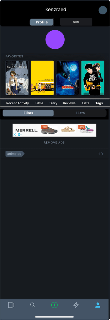
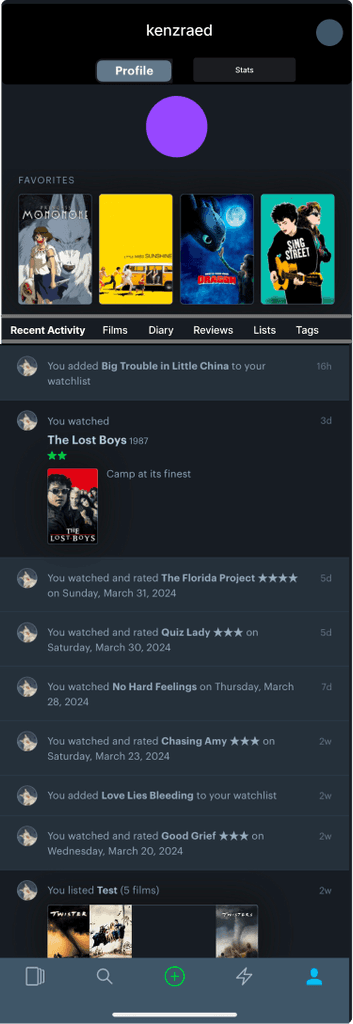
While making the high-fidelity designs, each tab had the same functions as it did on the actual app. These functions included the ability to add a movie, list, or tag, viewing settings, and filter options.
As this was for the non-patron design, I also made sure to include ads where a non-paying user would see them.
Patron Profile
Because Lettboxd's subscription option notably impacts the profile, I designed an updated patron profile as well.
Key design points: making space for the header image, adding follower counts to the bottom of the bio, and removing adds from the content.
user testing
"This is so much better! Everything is right there – it takes a few more steps to find things on regular letterboxd"
conclusion
next steps
A few users had expressed dissatisfaction with the layout of the homepage, saying that they never really used it. While brainstorming solutions, I'd briefly thought about how to redesign, but left it due to scope.
MUSINGS
Working on this project gave me great experience in thinking through the different facets of interaction design, and what makes something more or less confusing.
I also experienced trying something that didn't work, where I needed to take a step back and rethink what I was doing. After reminding myself of the "how might we's," and conducting more research, I could come up with a better, simpler solution than before.

