TLdR;
Salvage Angel is a vibrant vintage artisan mart located in Norwood, MA. They have over 70 in-store vendors, hundreds more lined up for their outdoor pop-up markets, and over 18,000 followers on both Instagram and Facebook — what they don't have is a website!
I worked with Salvage Angel to create a website that gives them a more professional online presence beyond their social media.
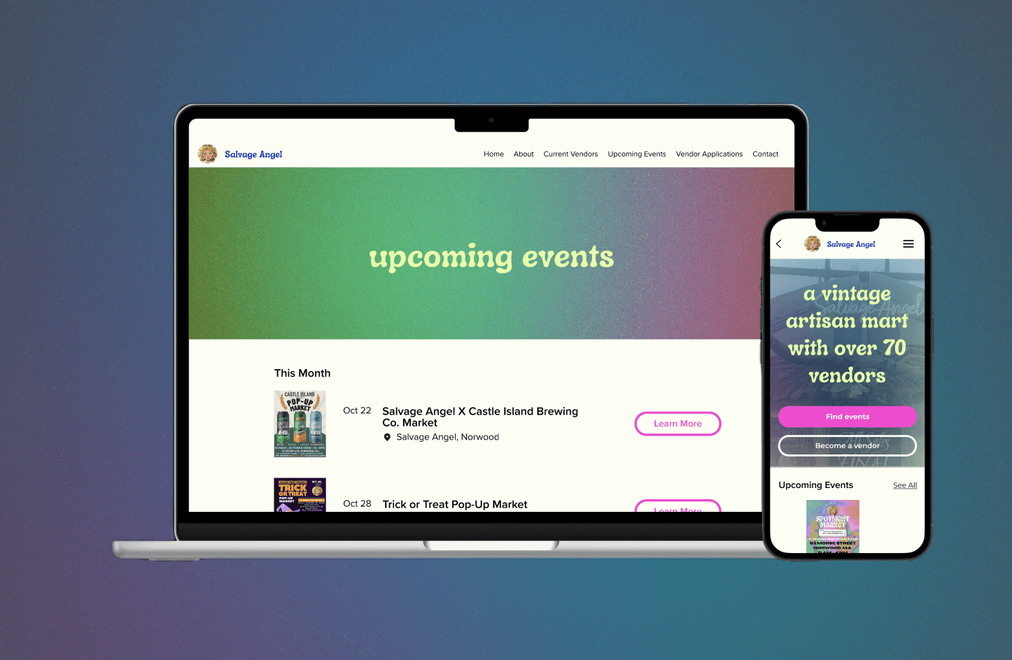
It acts as an informational site rather than an online shopping experience where customers can learn Salvage Angel's story & meet the team, discover vendors, apply to become a vendor, and find out about upcoming events. User testing showed overall approval of the site, although confusion with the mobile vendor application page led to a redesign of the layout.
Timeline: 3 weeks —completed October 2023
Project type: Responsive Website
Role: End-to-end UX designer
Tools: Figma, Mural
research
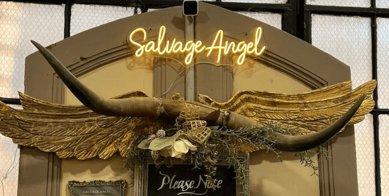
Although I'd been a customer at Salvage Angel for years, I knew next-to-nothing about the store's story or the people running the show. So, I started off my process of contextual interviews with one of the stakeholders. We completed our first interview in the store when it was closed, but there was still a flurry of activity. The owner was drilling big golden angel wings over the door, and her daughter was working on her own booth.
Through our interview, I learned that they didn't have a plan for their website, but that they wanted a more professional online presence that would strengthen their main goal, which is to continue to provide support to small businesses.
This is backed up by a competitive analysis which shows that all of the store's competitors have a website, thus giving them a more professional presence.
I also learned that the reason the store has been able to survive is due to Susan, the owner, and her and the store's ability to adapt and tendency to change.
These two things were also mentioned during my for my interviews with vendors and customers. Many of the interviewees had a hard time describing exactly what the store was. Eclectic, scrappy, and unique were a few of the repeated words.
user personas
I wanted to address three probable users of the website – customers and vendors. For my first customer, I created Jenna, a Gen Z/Millenial who is drawn to the nostalgia of the 90’s and Y2K style branding.
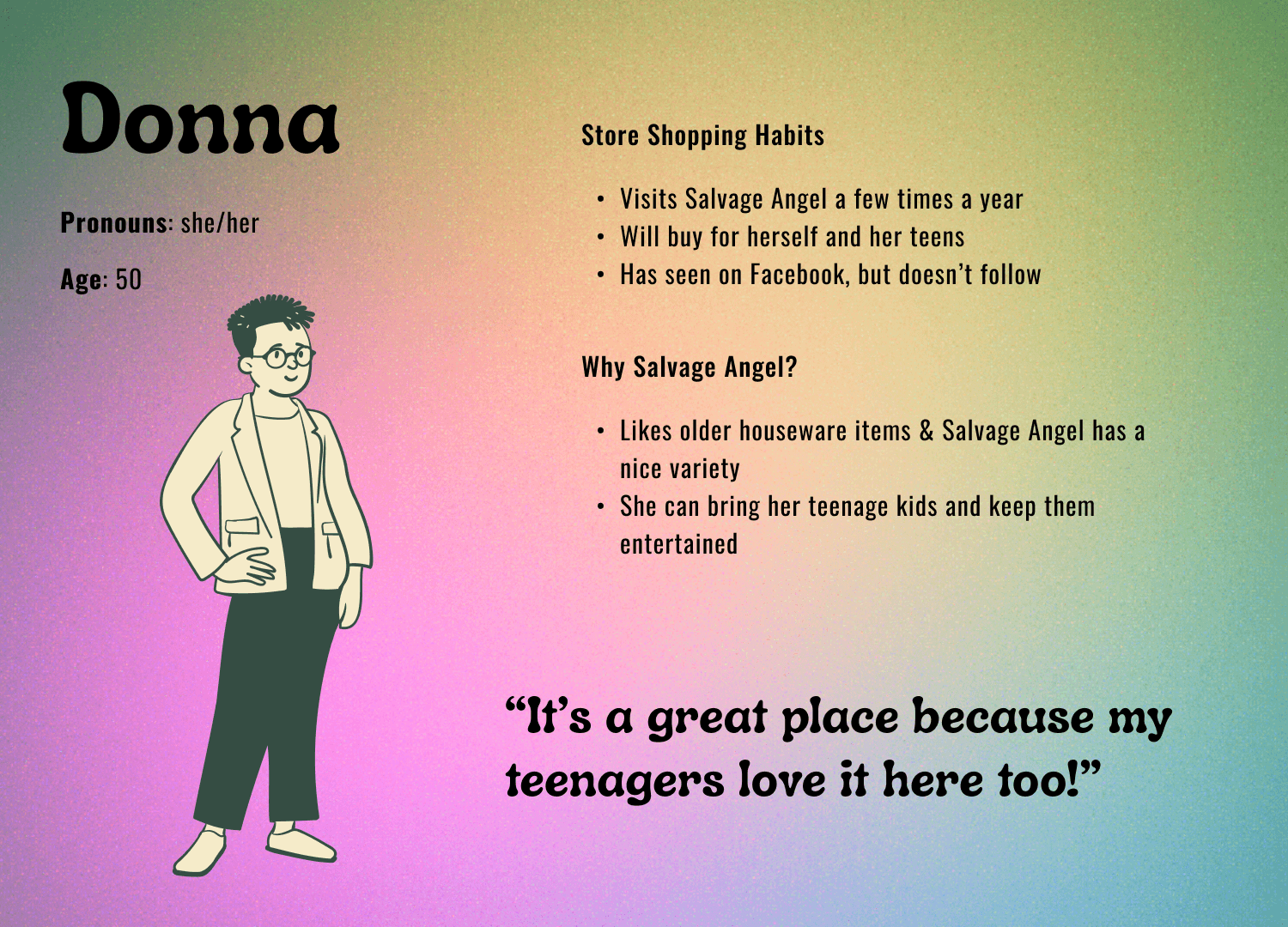
My second customer is Donna, a mom who has two teenage kids and struggles to find places they can all enjoy.
Finally, Henry is a vendor with a small booth that sells vintage housewares, records, and clothes. Henry is excited to have the visibility for their booth that a website will allow.


define
Then, it was time to start figuring out what the website was going to look like.
Point of view & how might we
Salvage Angel has an intriguing story, but why isn’t it being told?
Salvage Angel has multiple vendors, permanent & temporary, but where can someone find out who they are?
How might we help customers understand who Salvage Angel is as a store and who the vendors are so that they will have a deeper connection to the store?
Design
low-fidelity — design
Since the majority of the website's viewers will most likely be on mobile, I designed the desktop and mobile screens for each page at the same time. This allowed for seamless and consistent experience across platforms.


low-fidelity — usability testing
I conducted 5 unmoderated tests using Maze with the goals of receiving feedback on the layout and basic functions on both desktop and mobile, and discovering what's frustrating or confusing to users.
Tasks:
Find out when their next event is
Learn more about the business
Learn more about other vendors
Apply to be a vendor for the next event

key findings - positives
Accessible & easy to navigate
key findings - suggestions & pain points
Vendor information page: indicator for how many vendors there are or what page the user is on
Primary call to action on the home page is missing
high-fidelity — design
Moving into high-fidelity, I wanted to capture the Y2K and 90's nostalgia of the store's current brand, but also leave it easily changeable for when the store inevitably adapts again. I started out with a moodboard of the store's current branding:
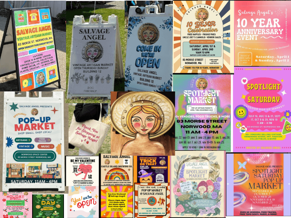
A common theme I noticed was the use of bright, fun colors and noisy gradients, as well as funky fonts. Present in almost all of the materials however, was their angelic logo. It had been mentioned to me that in the past, they'd tried to change their logo, how they never ended up feeling right. I was given this same opportunity, however I decided to keep what they had. This is because of what one of the vendors told me in our interview, which was that Susan had painted the angel and many others around the store like it, and that to him, it felt like multiple angels were always watching over the store and its customers and its staff at all times.


Testing
key insights
thought that the branding is consistent and makes sense for the store, and the hierarchy of information and navigation is clear.
were very confused by the drop-down menus on the mobile vendor application page
subsequent iterations
Rethinking the mobile vendor application layout
Originally, I thought it'd be better if the users could filter through the different kinds of events, but my testing showed that new visitors to the website didn't understand enough about the kinds of events to be able to do this. That's why I simplified the layout and made it match the desktop version where of the all application links are on the same page.
If Salvage Angel added a multitude of events on the same page, going back to something like this or adding in a filtering system is something to consider.

original


updated
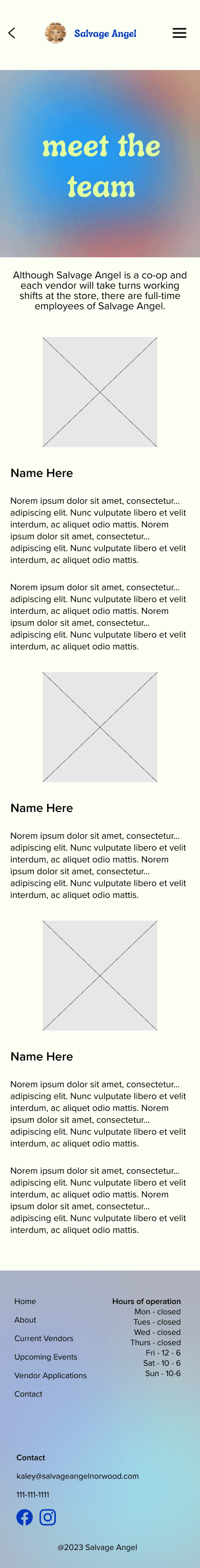
Meet the Team
A few of my users mentioned wanting to see this page after going through the test, and because it was in my "nice-to-have" features, I decided to add it. The number of employees was an estimation at this point because I hadn’t received any information from the store yet about what they wanted to have on this page.

conclusion
next steps
Photo Gallery/ Past Events
Although they're active on social media, I'd like for the website to have a designated page for a gallery. This was suggested to me during a usability test, and I think it would be a great place to showcase certain things that might get lost in Facebook and Instagram feeds.
Waiting for Feedback
At this point in the process, I've sent the designs over to Salvage Angel but haven't heard anything back yet. Once I hear from them, I will iterate accordingly and continue testing the site. I hope to see the website become fully functioning one day as well, whether a developer codes it or I create it on something like Squarespace.
MUSINGS
By far, the biggest thing I took away from this project was working with a client. Although I’ve helped out friends and family members with designs before, it was my first time working with stakeholders from a business with whom I had no prior relationship other than being a customer at the store. I was able to complete contextual interviews for the first time, which ended up giving me so much information that I learned to figure out what was more helpful for the website and which information was less so. Also, I had to go ahead with the high-fidelity designs even though they hadn’t sent me any copy for the site yet, and I wasn’t sure what photos they wanted to use – I sourced all of the photos from their Instagram.
Furthermore, I wasn’t given many specific parameters or instructions. Although strict rules and comprehensive style guides can be confining, they light the path for the designer. With only the vibe of their social media to go off of and one font they said they liked, I lit my own path.