designlab ux foundations
Foodie visual design
Overview
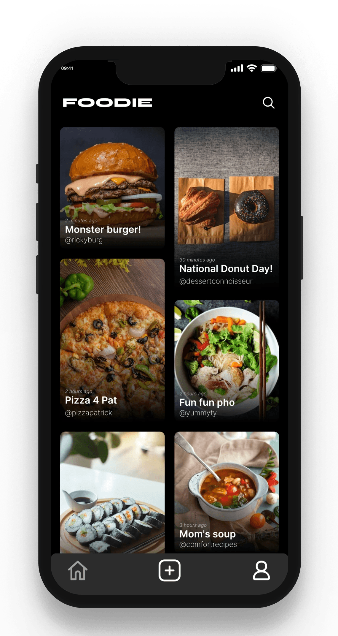
Foodie is a new mobile app that brings food lovers together to post photos of the best meals they’ve had and share their stories.
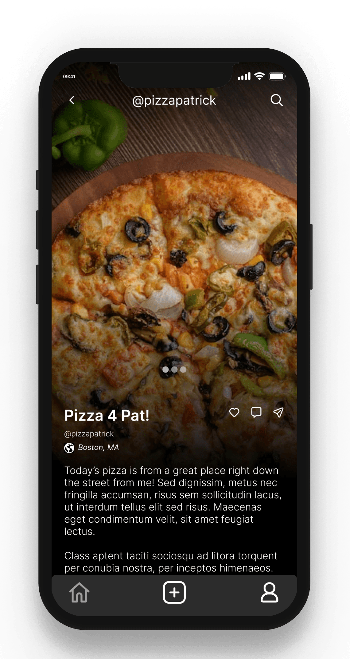
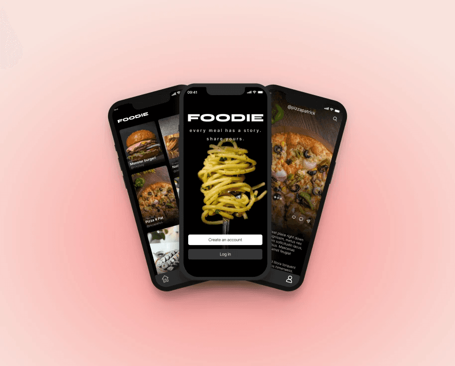
The company founder has asked you to design three sample screen designs for the app. They’ve provided you with both black and white versions of their logo to use in your design. The client also has two other requirements. First, apart from the photographs (which can be in full color), you’ve been asked to work only in black, white, and shades of gray. And finally, Foodie has asked that you use sans-serif fonts.
My process
A word that stuck out to me while reading the brief was "stories." This led me to envision an app that yes, had a focus on photos (because who doesn't want to see delicious food?), but also left space for longer commentary from the poster. I didn't want to just make Instagram for food; instead, I wanted to combine food blogging with social media.
While figuring out the look of the home screen, I sketched versions reminiscent of Instagram and other social media apps, but ended up following a Pinterest-inspired route, although now the individual cards would include a blog title, account name, and time posted. I imagine tapping on a card would open up the blog post, which then, users could read, comment, like, and swipe left or right to the adjacent post.
The screens were completed within the project guidelines and time constraints, so this is what I would've done next: further develop the home page by adding a filter system/following and explore tabs, and develop screens for profile/search pages.